Author Archives: gesecolor
VISUAL CONCETP & LOGO FOR RTU DESIGN FACTORY
My dream about having special , high level design study place in Riga seems to be fulfilled. Congratulations to https://instagram.com/p/5E3XWbmSGI/ #RTU & Latvian design scene, finally we got some university, where design projects will be done thru research, education &

WEB CONCEPT FOR CELEBRITY FITNESS TRAINER
Terri Walsh needed a new concept of her old website after she got a new logo & colors. Project is in construction stage. The design needed to be all device friendly so the streaming of her video trainings could be
WEB CONCEPT FOR CELEBRITY FITNESS TRAINER
Terri Walsh needed a new concept of her old website after she got a new logo & colors. Project is in construction stage. The design needed to be all device friendly so the streaming of her video trainings could be

LOGO FOR PERSONAL FITNESS TRAINER
Terry Walsh is one fantastic lady! She runs her own fitness classes in NY under name ACTIVE RESISTANCE TRAININGS. She needed a full re-branding, so i started with logo. Web page is under construction now & print materials hopefully alongside
LOGO FOR PERSONAL FITNESS TRAINER
Terry Walsh is one fantastic lady! She runs her own fitness classes in NY under name ACTIVE RESISTANCE TRAININGS. She needed a full re-branding, so i started with logo. Web page is under construction now & print materials hopefully alongside
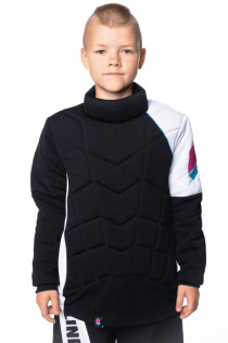
KIDS GOALIE SET for innebandy
Kids set for Blindsave was a task where minimalistic and asymetric look was requested according to that seasons visual path. The main idea from Blindsave was to come-up with protection vest which could serve as jersey at the same time.
KIDS GOALIE SET for innebandy
Kids set for Blindsave was a task where minimalistic and asymetric look was requested according to that seasons visual path. The main idea from Blindsave was to come-up with protection vest which could serve as jersey at the same time.

BRANDING FOR PROOF – ADVISORY GROUP
I took a GREEK LETTER “P” a symbol from math in a style of Stonehenge building “A dream come true structure – proof of long standing roof”. Name , tag-line and logo were created for this ambitious team within a
BRANDING FOR PROOF – ADVISORY GROUP
I took a GREEK LETTER “P” a symbol from math in a style of Stonehenge building “A dream come true structure – proof of long standing roof”. Name , tag-line and logo were created for this ambitious team within a
FLOORBALL STICK VISUALS
This task came to me thru my side project The City Looks from very active & attractive company Generation Floorball, which is introducing floorball to children & Youth precisely in USA & Canada. The aim was to help to come-up
FLOORBALL STICK VISUALS
This task came to me thru my side project The City Looks from very active & attractive company Generation Floorball, which is introducing floorball to children & Youth precisely in USA & Canada. The aim was to help to come-up

LOGO FOR FINANCE COMPANY
This was the task where i came in when the company http://www.zenithfinance.com.au/ already had a logo for several years, they needed it to be re-done so it fits more to a modern feeling, so it gets more corporate look, with leaving
LOGO FOR FINANCE COMPANY
This was the task where i came in when the company http://www.zenithfinance.com.au/ already had a logo for several years, they needed it to be re-done so it fits more to a modern feeling, so it gets more corporate look, with leaving
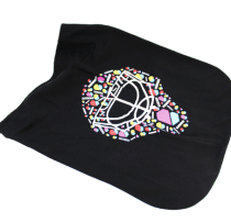
FLOORBALL SPORTSWEAR packaging
Light weighted , compact & easy in production Blindsave requested packaging items for storing sportswear products & displayig them in sports shops – so mostly HANG TAGDS were in need for this smple & cozy task. View this post on
FLOORBALL SPORTSWEAR packaging
Light weighted , compact & easy in production Blindsave requested packaging items for storing sportswear products & displayig them in sports shops – so mostly HANG TAGDS were in need for this smple & cozy task. View this post on
NOVACCA
Novacca aims to produce highly purified animal-free proteins for infant nutrition, medical applications / nutraceuticals and reagents. http://novacca.com/ Swedish company combines science with nature. A simplified icon of circle shaped container , were cells are examined and a combination of
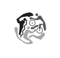
ICON BASED LOGO FOR FRANKFURT CITY TRIATHLON
An icon for Frankfurt City Triathlon (typo they changed each year, not always to the better result, but icon stayed the same) I designed this logo several years ago, but decided to place it here, because this season somehow sports
ICON BASED LOGO FOR FRANKFURT CITY TRIATHLON
An icon for Frankfurt City Triathlon (typo they changed each year, not always to the better result, but icon stayed the same) I designed this logo several years ago, but decided to place it here, because this season somehow sports
