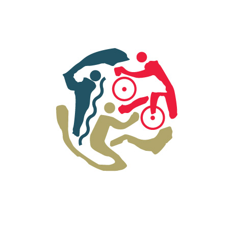
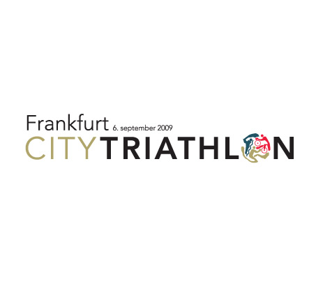
An icon for Frankfurt City Triathlon (typo they changed each year, not always to the better result, but icon stayed the same) I designed this logo several years ago, but decided to place it here, because this season somehow sports are more than ever actual on my working desk & i this logo in is active usage for 4 years already in Germany, so i just can not forget it. Emblem was made in a style of well known artist Matisse, that is why the circle shape is not a perfect round. There are three elements incorporated into this emblem to show three disciplines of triathlon: running, swimming & cycling. Colors that year we picked together with an owner of this event & our answer to a question why they are not brighter, more toxic or more sporty look alike, is that we wanted this color scheme to apply more to a 25 year & above audience rather than to 15-25 what would be a Youth target group then with pink, salad green & flame red in that case. Get more info about this fantastic event on Twitter & Facebook . Sport is a unity, heh!