Posts Tagged: logo
¨UNITY RIDE ¨CYCLING EVENT BRANDING / VIENĪBAS BRAUCIENS 35.
This cycling event is celebrated since the end of the past century, a symbol of independent Latvia. Uniting cyclists to celebrate liberty , sporty lifestyle, national spirit etc. This year deserved a special rebranding due to it´s 35th anniversary, but
ĒDIENA DABA logo
Logo for TV SHOW “ĒDIENA DABA” *NATURE OF FOOD* about #natural #eco #food from farms & local producers in Latvia territory is translated on TV3 The task was simple & tricky at the same time: reflect a combinaiton of two
ĒDIENA DABA logo
Logo for TV SHOW “ĒDIENA DABA” *NATURE OF FOOD* about #natural #eco #food from farms & local producers in Latvia territory is translated on TV3 The task was simple & tricky at the same time: reflect a combinaiton of two

ELEMENTO
Concrete design element Company based in South Africa, leaning with it’s products towards European markets needed a logo, which could represent the core idea of what their products are made-of – WATER, WIND, SAND… – COMBINED IN ONE ELEMENT SYMBOLICALLY
ELEMENTO
Concrete design element Company based in South Africa, leaning with it’s products towards European markets needed a logo, which could represent the core idea of what their products are made-of – WATER, WIND, SAND… – COMBINED IN ONE ELEMENT SYMBOLICALLY
FOOTBALL CLUB / for junior soccer clubs alliance member
Junior Footbll club Carnikava. The task was defined clear – to turn the symbol of the main sponsor for new kid’s football club into the style of the sport’s emblem appealing for children, yet not to be too cartoonish and
FOOTBALL CLUB / for junior soccer clubs alliance member
Junior Footbll club Carnikava. The task was defined clear – to turn the symbol of the main sponsor for new kid’s football club into the style of the sport’s emblem appealing for children, yet not to be too cartoonish and

ICE-HOCKEY CLUB
Baltic Wolves / KId’s ice hockey club school. Kid’s theme involvement as well as northern/winter symbolic was essential to be introduced into NHL style logo for specific ice-hockey club. So an icicles , ice cube and a wolf head as
ICE-HOCKEY CLUB
Baltic Wolves / KId’s ice hockey club school. Kid’s theme involvement as well as northern/winter symbolic was essential to be introduced into NHL style logo for specific ice-hockey club. So an icicles , ice cube and a wolf head as
BOLD – NATURAL – BEAUTIFUL
Logo and packaging for hair beauty care producer, which works which natural ingredients and specializes for Afro-American hair treatment and beautification. The symbol is a mix of abstract shape of chocolate bean structure stencil and wavy , curvy hair visualization.
BOLD – NATURAL – BEAUTIFUL
Logo and packaging for hair beauty care producer, which works which natural ingredients and specializes for Afro-American hair treatment and beautification. The symbol is a mix of abstract shape of chocolate bean structure stencil and wavy , curvy hair visualization.

HIGHLY SENSITIVE AND SUCCESSFUL
This was very feminine & artistic task for personal coach for Highly Sensitive individuals – main target group: women. Owner of this practice in CA – Debbie Lynn Grace wanted to incorporate her own highly sensitive, brave & in the
HIGHLY SENSITIVE AND SUCCESSFUL
This was very feminine & artistic task for personal coach for Highly Sensitive individuals – main target group: women. Owner of this practice in CA – Debbie Lynn Grace wanted to incorporate her own highly sensitive, brave & in the
THE YOGA PROFESSIONAL (sub-branding)
The Yoga Professional brand development came to me during brand consulting for parent brand of Katie Brauer , so i was able to understand the essence of this service – Katie provides from the very core & create sign, which
THE YOGA PROFESSIONAL (sub-branding)
The Yoga Professional brand development came to me during brand consulting for parent brand of Katie Brauer , so i was able to understand the essence of this service – Katie provides from the very core & create sign, which
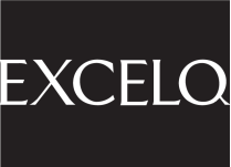
EXCELQ
The concept of mathematical value comparison – “greater than” combined with the abstract uppercase letter “E” was selected to represent company , which deals with personal consulting, shart creation and other technical themes related to office “softs” and programming Excelq.
EXCELQ
The concept of mathematical value comparison – “greater than” combined with the abstract uppercase letter “E” was selected to represent company , which deals with personal consulting, shart creation and other technical themes related to office “softs” and programming Excelq.
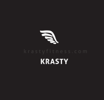
BRANDING FOR PERSONAL TRAINING
Brand name comes from a nick name of the owner of this studio,but brand icon has deeper story behind it – this trainer has a surename – dzerve, which means a bird in latvian language, so he wanted somehting wat
BRANDING FOR PERSONAL TRAINING
Brand name comes from a nick name of the owner of this studio,but brand icon has deeper story behind it – this trainer has a surename – dzerve, which means a bird in latvian language, so he wanted somehting wat
