Category Archives: icon design
ĒDIENA DABA logo
Logo for TV SHOW “ĒDIENA DABA” *NATURE OF FOOD* about #natural #eco #food from farms & local producers in Latvia territory is translated on TV3 The task was simple & tricky at the same time: reflect a combinaiton of two
ĒDIENA DABA logo
Logo for TV SHOW “ĒDIENA DABA” *NATURE OF FOOD* about #natural #eco #food from farms & local producers in Latvia territory is translated on TV3 The task was simple & tricky at the same time: reflect a combinaiton of two

ICE-HOCKEY CLUB
Baltic Wolves / KId’s ice hockey club school. Kid’s theme involvement as well as northern/winter symbolic was essential to be introduced into NHL style logo for specific ice-hockey club. So an icicles , ice cube and a wolf head as
ICE-HOCKEY CLUB
Baltic Wolves / KId’s ice hockey club school. Kid’s theme involvement as well as northern/winter symbolic was essential to be introduced into NHL style logo for specific ice-hockey club. So an icicles , ice cube and a wolf head as
BOLD – NATURAL – BEAUTIFUL
Logo and packaging for hair beauty care producer, which works which natural ingredients and specializes for Afro-American hair treatment and beautification. The symbol is a mix of abstract shape of chocolate bean structure stencil and wavy , curvy hair visualization.
BOLD – NATURAL – BEAUTIFUL
Logo and packaging for hair beauty care producer, which works which natural ingredients and specializes for Afro-American hair treatment and beautification. The symbol is a mix of abstract shape of chocolate bean structure stencil and wavy , curvy hair visualization.
EXCELQ
The concept of mathematical value comparison – “greater than” combined with the abstract uppercase letter “E” was selected to represent company , which deals with personal consulting, shart creation and other technical themes related to office “softs” and programming Excelq.
EXCELQ
The concept of mathematical value comparison – “greater than” combined with the abstract uppercase letter “E” was selected to represent company , which deals with personal consulting, shart creation and other technical themes related to office “softs” and programming Excelq.
BRANDING FOR PERSONAL TRAINING
Brand name comes from a nick name of the owner of this studio,but brand icon has deeper story behind it – this trainer has a surename – dzerve, which means a bird in latvian language, so he wanted somehting wat
BRANDING FOR PERSONAL TRAINING
Brand name comes from a nick name of the owner of this studio,but brand icon has deeper story behind it – this trainer has a surename – dzerve, which means a bird in latvian language, so he wanted somehting wat
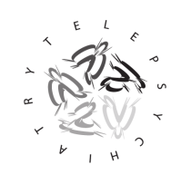
MIND CONNECT MD telepcyhiatry branding start.
Mind Connect MD covers psychology practice by trendy telemedicine approach. …I came-up with symbolic dynamic rotating circle direction, could be translated as an association of those abstract, modern art style images of tests for Brain Activity – playing creativity!
LOGO ICON FOR THE SAFETY WORK GEAR DISTRIBUTOR
The main thing were to combine well known safety pattern (yellow, black, yellow, black,yellow..) & pointing arrow into the one icon. Together with a client we selected the option, where arrow was pointing to various directions & still have the
LOGO ICON FOR THE SAFETY WORK GEAR DISTRIBUTOR
The main thing were to combine well known safety pattern (yellow, black, yellow, black,yellow..) & pointing arrow into the one icon. Together with a client we selected the option, where arrow was pointing to various directions & still have the
ASHLEK
Ashlek – means power. Creators of this brand wanted some sign which reflects the name in a symbol combined with meaning of Alfa-Man , to make accent on explanation that this will be the sporty clothes and accessories for man.
ASHLEK
Ashlek – means power. Creators of this brand wanted some sign which reflects the name in a symbol combined with meaning of Alfa-Man , to make accent on explanation that this will be the sporty clothes and accessories for man.

LOGO AND VISUAL APPEARANCE CONCEPT FOR ARTIZEN STUDIO
Artizen name originates from ‘artisan,’ the idea of a craftsman creating unique one-of-a-kind products with a lot of originality and uniqueness. Also art + zen, Zen in this case as a symbol for balancing, proportion seeking, harmonic solutions. These guys

LOGO FOR IT AND HEALTHCARE BASED COMPANY
Logo concept for Pelesend Company is on sale discussions now, so the new logo was used only on business cards yet. The logo needed to remind viewer about Hawaian mythology (one of cofounders is form Hawai, so he added its’
LOGO FOR IT AND HEALTHCARE BASED COMPANY
Logo concept for Pelesend Company is on sale discussions now, so the new logo was used only on business cards yet. The logo needed to remind viewer about Hawaian mythology (one of cofounders is form Hawai, so he added its’
