Author Archives: gesecolor
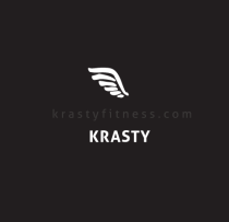
BRANDING FOR PERSONAL TRAINING
Brand name comes from a nick name of the owner of this studio,but brand icon has deeper story behind it – this trainer has a surename – dzerve, which means a bird in latvian language, so he wanted somehting wat
BRANDING FOR PERSONAL TRAINING
Brand name comes from a nick name of the owner of this studio,but brand icon has deeper story behind it – this trainer has a surename – dzerve, which means a bird in latvian language, so he wanted somehting wat
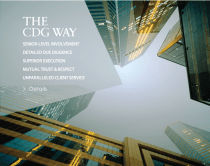
ANGLED WEB PAGE DESIGN
Web design for Accounting Company CDG group http://www.cdgco.com/ web design was revised under Starkman & associates agency, where i took a part at that time. This website needed to be clean, sleek, elegant, minimal at the same time. So there
ANGLED WEB PAGE DESIGN
Web design for Accounting Company CDG group http://www.cdgco.com/ web design was revised under Starkman & associates agency, where i took a part at that time. This website needed to be clean, sleek, elegant, minimal at the same time. So there
Sidonie – TECHNOLOGY BRAND FOR FRENCH SPEAKING SENIORS
Was working on this generous brand Sidonie under France based IT & developement company. (2sker for sidonie) Was proudly involved into creation of full brand look & visual appearance – starting from logo, continuing with phones’ app interface, web structure

LOGO & STYLE FOR SOCIAL MEDIA APP
This logo in a theme of percentage symbol was done recently for the picture voting app. Let’s see how guys will spread their idea! logo & color needed to appeal to a feminine audience, but by taking in count that
LOGO & STYLE FOR SOCIAL MEDIA APP
This logo in a theme of percentage symbol was done recently for the picture voting app. Let’s see how guys will spread their idea! logo & color needed to appeal to a feminine audience, but by taking in count that
LOGO FOR REAL ESTATE INVESTMENT COMPANY
Logo with an icon, based on the idea about honey comb structure for the company, which practices in real estate investment, renovation & funding – DUCCESS. The aim was to show the multi-layer structure , in the same time to
LOGO FOR REAL ESTATE INVESTMENT COMPANY
Logo with an icon, based on the idea about honey comb structure for the company, which practices in real estate investment, renovation & funding – DUCCESS. The aim was to show the multi-layer structure , in the same time to

WEBPAGE FOR MORE THAN YOGA STUDIO
Web page for Move With Grace (Brooklyn) based Yoga studio Well yeah, when the logo was created then webpage was re-launched as well. Take a look: http://movewithgrace.com/ . As Grace is very busy person & her time is really valuable, it was
WEBPAGE FOR MORE THAN YOGA STUDIO
Web page for Move With Grace (Brooklyn) based Yoga studio Well yeah, when the logo was created then webpage was re-launched as well. Take a look: http://movewithgrace.com/ . As Grace is very busy person & her time is really valuable, it was
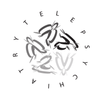
MIND CONNECT MD telepcyhiatry branding start.
Mind Connect MD covers psychology practice by trendy telemedicine approach. …I came-up with symbolic dynamic rotating circle direction, could be translated as an association of those abstract, modern art style images of tests for Brain Activity – playing creativity!
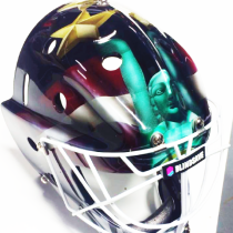
AIRBRUSH PAINTING ON GOALIE MASK
For #WFC2014 i did this mask for #latvian national #floorball team shortly before the games they were playing in Gotheborg. The task was to integrate sponsros’ brand logo & name in a national colors & blend into composition of latvian
AIRBRUSH PAINTING ON GOALIE MASK
For #WFC2014 i did this mask for #latvian national #floorball team shortly before the games they were playing in Gotheborg. The task was to integrate sponsros’ brand logo & name in a national colors & blend into composition of latvian
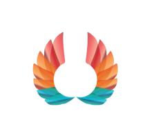
ICON LOGO AND VISUAL LOOK FOR EVENT ORGANIZATOR
We needed something what represents some kind of competition & winner spirit! Something what could work for encouraging people to try out new things or things Your friend tried, but You were not brave or interested into enough! So the
ICON LOGO AND VISUAL LOOK FOR EVENT ORGANIZATOR
We needed something what represents some kind of competition & winner spirit! Something what could work for encouraging people to try out new things or things Your friend tried, but You were not brave or interested into enough! So the
LOGO ICON FOR THE SAFETY WORK GEAR DISTRIBUTOR
The main thing were to combine well known safety pattern (yellow, black, yellow, black,yellow..) & pointing arrow into the one icon. Together with a client we selected the option, where arrow was pointing to various directions & still have the
LOGO ICON FOR THE SAFETY WORK GEAR DISTRIBUTOR
The main thing were to combine well known safety pattern (yellow, black, yellow, black,yellow..) & pointing arrow into the one icon. Together with a client we selected the option, where arrow was pointing to various directions & still have the
