Author Archives: gesecolor
BOBSLEIGH LATVIA 2026 OLYMPICS
All begins with an inspiration, deep research, mood seek , talking with specialists who knows about translating on tv screens these spectacular games from each point, angle etc – connecting my personal wide an 20 year long know how leading
BOBSLEIGH LATVIA 2026 OLYMPICS
All begins with an inspiration, deep research, mood seek , talking with specialists who knows about translating on tv screens these spectacular games from each point, angle etc – connecting my personal wide an 20 year long know how leading
SKELETON CORTINA 2026 OLYMPICS
All begins with an inspiration, deep research, mood seek , talking with specialists who knows about translating on tv screens these spectacular games from each point, angle etc – connecting my personal wide an 20 year long know how leading
SKELETON CORTINA 2026 OLYMPICS
All begins with an inspiration, deep research, mood seek , talking with specialists who knows about translating on tv screens these spectacular games from each point, angle etc – connecting my personal wide an 20 year long know how leading
¨UNITY RIDE ¨CYCLING EVENT BRANDING / VIENĪBAS BRAUCIENS 35.
This cycling event is celebrated since the end of the past century, a symbol of independent Latvia. Uniting cyclists to celebrate liberty , sporty lifestyle, national spirit etc. This year deserved a special rebranding due to it´s 35th anniversary, but
MOUNTINE BIKE MARATHON MOOD UPDATE
5 years ago a great collaboration with velo.lv was made , we updated totally branding style direction for Latvian Mountine Bike Marathon. Main focus back then was on the logo and slogan itself. After that several agencies took their part
MOUNTINE BIKE MARATHON MOOD UPDATE
5 years ago a great collaboration with velo.lv was made , we updated totally branding style direction for Latvian Mountine Bike Marathon. Main focus back then was on the logo and slogan itself. After that several agencies took their part
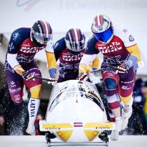
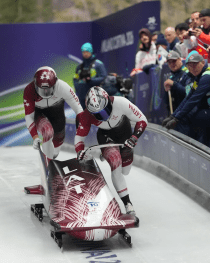
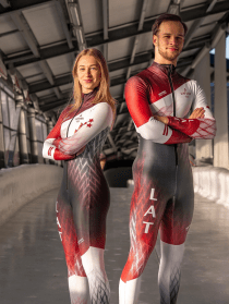
CHAMPIONSHIP IN BOBSLEIGH AND SKELETON 24/25 SEASON´S BRANDING
Spent a challenging , but cheerful autumn under the task of creating new branding for athletes of LBSF ( Latvian Bosbleigh and Skeleton Federation ) for the World Championship season 2024-2025. Visual element redesign and new sponsor logo placement coposition

CHAMPION GAME
Branding and product design for a children’s game that connects generations. This educational and engaging table game, created by sports expert Igo Japins, encourages calculation, writing, concentration, and socializing without screens. It not only provides a fun break from computers
CHAMPION GAME
Branding and product design for a children’s game that connects generations. This educational and engaging table game, created by sports expert Igo Japins, encourages calculation, writing, concentration, and socializing without screens. It not only provides a fun break from computers

SAFETY PADS FOR 1protectionbrand BLINDSAVE GOALIE MASK
This was very interesting task with research work & literary MONTHS of getting the right shape. An innovative material was found & provided by the company blindsave, who asked me to work on this protection gear task. The whole trick
SAFETY PADS FOR 1protectionbrand BLINDSAVE GOALIE MASK
This was very interesting task with research work & literary MONTHS of getting the right shape. An innovative material was found & provided by the company blindsave, who asked me to work on this protection gear task. The whole trick
ETNOGRAPHICAL YET MODERN LOOK OF Latvian school in New York / YONKER.
It was a honor to make a present for this Latvian School in New York: a new logo! the task was really clear, not a big chance to step aside or invent somethign completely new, but it was challenging enough
ETNOGRAPHICAL YET MODERN LOOK OF Latvian school in New York / YONKER.
It was a honor to make a present for this Latvian School in New York: a new logo! the task was really clear, not a big chance to step aside or invent somethign completely new, but it was challenging enough

LATVIAN MTB MARATHON
In cooperation with velo.lv and Latvian Bycicling Federation the Latvian Mountine Bike Marathon was rebranded: INFINITY SYMBOL MADE OUT OF TWO COMBINED STYLIZED TYRES IN THE ACTIVE SPINNING – means collaboration, never-ending endurance, life cycle and riding. The marathon unites world
ĒDIENA DABA logo
Logo for TV SHOW “ĒDIENA DABA” *NATURE OF FOOD* about #natural #eco #food from farms & local producers in Latvia territory is translated on TV3 The task was simple & tricky at the same time: reflect a combinaiton of two
ĒDIENA DABA logo
Logo for TV SHOW “ĒDIENA DABA” *NATURE OF FOOD* about #natural #eco #food from farms & local producers in Latvia territory is translated on TV3 The task was simple & tricky at the same time: reflect a combinaiton of two
