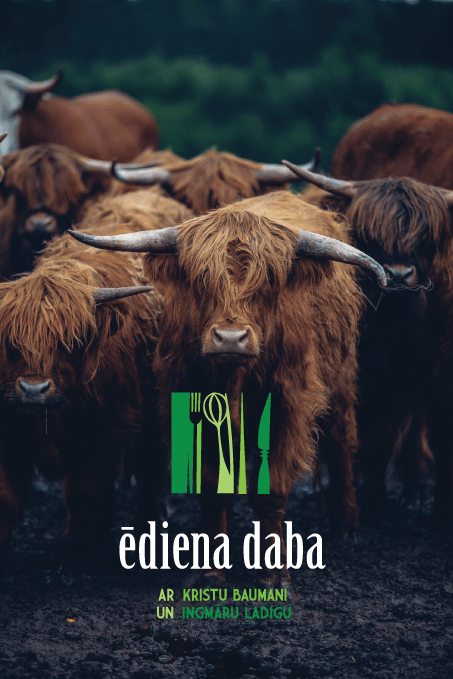
Logo for TV SHOW “ĒDIENA DABA” *NATURE OF FOOD* about #natural #eco #food from farms & local producers in Latvia territory is translated on TV3
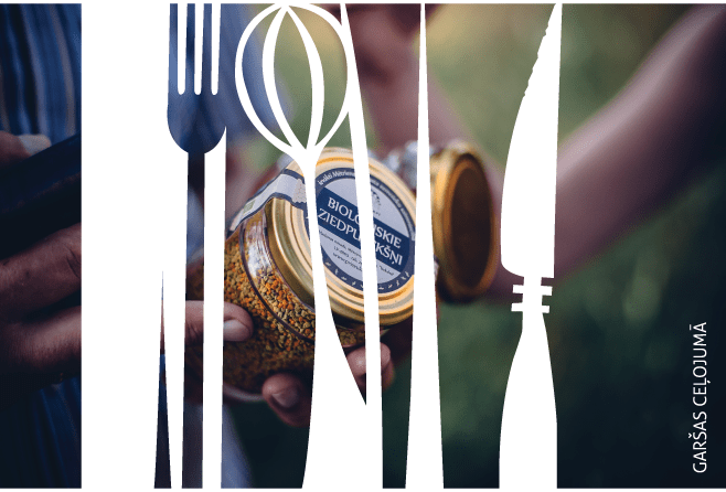
The task was simple & tricky at the same time: reflect a combinaiton of two words in one sign, by taking in count that it should be animated later & not too flat & too boring for large tv screens. But avoid using to much elements to escape switching towards illustration more than to the logo.
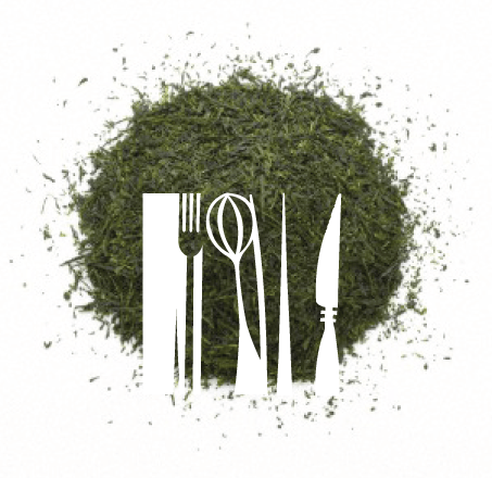
Symbolic exlanation / grass stands for nature & kitchen tols for the symbol of food and that combination growing and being alive.
At first i thought that fo each of serie a distinctive color could be used to accent the theme of each serie, but in the end green color was selected due to aim of appear similar to the ECO theme stereotype as supporters of this show were Europe Eco Food Association as well as Eco Product Mark from Baltic state, both of which are using this common, well recognized geen theme in their brandings as well.