Posts Tagged: BRANDING
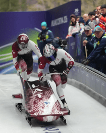
BOBSLEIGH LATVIA 2026 OLYMPICS
All begins with an inspiration, deep research, mood seek , talking with specialists who knows about translating on tv screens these spectacular games from each point, angle etc – connecting my personal wide an 20 year long know how leading
BOBSLEIGH LATVIA 2026 OLYMPICS
All begins with an inspiration, deep research, mood seek , talking with specialists who knows about translating on tv screens these spectacular games from each point, angle etc – connecting my personal wide an 20 year long know how leading
SKELETON CORTINA 2026 OLYMPICS
All begins with an inspiration, deep research, mood seek , talking with specialists who knows about translating on tv screens these spectacular games from each point, angle etc – connecting my personal wide an 20 year long know how leading
SKELETON CORTINA 2026 OLYMPICS
All begins with an inspiration, deep research, mood seek , talking with specialists who knows about translating on tv screens these spectacular games from each point, angle etc – connecting my personal wide an 20 year long know how leading
¨UNITY RIDE ¨CYCLING EVENT BRANDING / VIENĪBAS BRAUCIENS 35.
This cycling event is celebrated since the end of the past century, a symbol of independent Latvia. Uniting cyclists to celebrate liberty , sporty lifestyle, national spirit etc. This year deserved a special rebranding due to it´s 35th anniversary, but
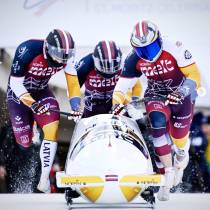
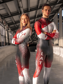
CHAMPIONSHIP IN BOBSLEIGH AND SKELETON 24/25 SEASON´S BRANDING
Spent a challenging , but cheerful autumn under the task of creating new branding for athletes of LBSF ( Latvian Bosbleigh and Skeleton Federation ) for the World Championship season 2024-2025. Visual element redesign and new sponsor logo placement coposition

ELEMENTO
Concrete design element Company based in South Africa, leaning with it’s products towards European markets needed a logo, which could represent the core idea of what their products are made-of – WATER, WIND, SAND… – COMBINED IN ONE ELEMENT SYMBOLICALLY
ELEMENTO
Concrete design element Company based in South Africa, leaning with it’s products towards European markets needed a logo, which could represent the core idea of what their products are made-of – WATER, WIND, SAND… – COMBINED IN ONE ELEMENT SYMBOLICALLY
BOLD – NATURAL – BEAUTIFUL
Logo and packaging for hair beauty care producer, which works which natural ingredients and specializes for Afro-American hair treatment and beautification. The symbol is a mix of abstract shape of chocolate bean structure stencil and wavy , curvy hair visualization.
BOLD – NATURAL – BEAUTIFUL
Logo and packaging for hair beauty care producer, which works which natural ingredients and specializes for Afro-American hair treatment and beautification. The symbol is a mix of abstract shape of chocolate bean structure stencil and wavy , curvy hair visualization.

HIGHLY SENSITIVE AND SUCCESSFUL
This was very feminine & artistic task for personal coach for Highly Sensitive individuals – main target group: women. Owner of this practice in CA – Debbie Lynn Grace wanted to incorporate her own highly sensitive, brave & in the
HIGHLY SENSITIVE AND SUCCESSFUL
This was very feminine & artistic task for personal coach for Highly Sensitive individuals – main target group: women. Owner of this practice in CA – Debbie Lynn Grace wanted to incorporate her own highly sensitive, brave & in the
THE YOGA PROFESSIONAL (sub-branding)
The Yoga Professional brand development came to me during brand consulting for parent brand of Katie Brauer , so i was able to understand the essence of this service – Katie provides from the very core & create sign, which
THE YOGA PROFESSIONAL (sub-branding)
The Yoga Professional brand development came to me during brand consulting for parent brand of Katie Brauer , so i was able to understand the essence of this service – Katie provides from the very core & create sign, which

EXCELQ
The concept of mathematical value comparison – “greater than” combined with the abstract uppercase letter “E” was selected to represent company , which deals with personal consulting, shart creation and other technical themes related to office “softs” and programming Excelq.
EXCELQ
The concept of mathematical value comparison – “greater than” combined with the abstract uppercase letter “E” was selected to represent company , which deals with personal consulting, shart creation and other technical themes related to office “softs” and programming Excelq.

CHOICE APP ( brand & UI )
Meet the app for predicting political side of voting theme in certain area: CHOICE App. An idea behind the visual identity and user interface was defined quite clearly form their developers, so my work was to come-up with the way
CHOICE APP ( brand & UI )
Meet the app for predicting political side of voting theme in certain area: CHOICE App. An idea behind the visual identity and user interface was defined quite clearly form their developers, so my work was to come-up with the way
