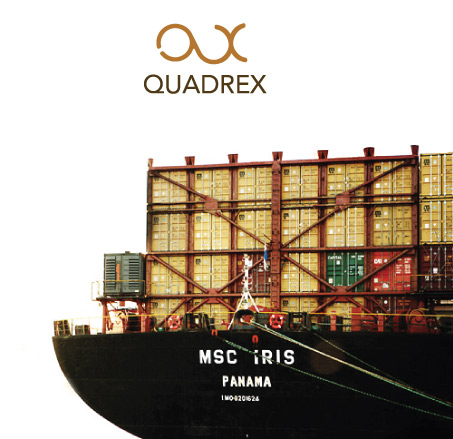
This was done quite time ago, but still in use & that’s why i shared this curvy, but not feminine! icon & logo name of the industrial material selling company in Baltic states. They wanted icon along the company name, but both create din sch a way, so they could be used apart each from other & could stand solid. Actually that’s a sign of first & last letter of the name, just instead of completely repeating the logo name typo shape, it is curved way much more, but because of the brown color palette & the logo name boldness, in overall this is a masculine icon & mark combination.
- Comment
- Reblog
-
Subscribe
Subscribed
Already have a WordPress.com account? Log in now.
